As a crystallization of human wisdom, packaging has been widely used in life and production. As early as 3000 BC, Egyptians began to use manual methods to cast and blow original glass bottles for clothing items. At the same time, Egyptians used papyrus. The heart of grass made a kind of original paper for packaging items. In 105 BC, Cai Lun invented papermaking. In China, there was a label made of hand-made paper. In the long history of the development of human history, packaging design has promoted the continuous development of human civilization. Today, packaging has not only stayed at the level of product protection, it has brought humans the visual pleasure of the perfect combination of art and technology, as well as super. Psychological enjoyment of value.
As a packaging designer in the new era, we must give packaging a new design concept. We must understand the society, understand the enterprise, understand the products, understand the consumers, and make accurate design positioning. The idea of ​​packaging design is a strategic design guideline. Without positioning, there is no purpose, targeted, there is no target audience, the product will not be sold out, which will lose the significance of a new era of packaging design, only to follow the design rules in order to make the design suitable for the needs of the development of the times. The developed countries proposed the positioning of five "W" design ideas, and it is worth learning and learning from us, that is: What (What) refers to the design first of all telling consumers what products this is; who is designed for (Who)? Who is the object of the merchandise? What time? When (wher)? Refers to the designer do not forget the time and place of the product; Why (Why)? Refers to the designer Why use this visual image design.
As a modern packaging design education, students are largely lacking the positioning concept of the "W", or positioning is not accurate enough. When our students are doing package design, they are not vague about What, Who, When, and Wer. The understanding of Why is not deep enough. It is precisely the most basic quality that a designer has. Students often do not know why such a visual image is used as a design expression element. It is only based on feelings. It feels that formal beauty can be, but ignores the fact that the form serves content. Even the best form cannot precisely convey the content of the product. It is also a failed design. In the classroom, it is often found that students are first designed after the concept, and then according to the design draft take it for granted to give it a design concept, which is completely contrary to the design law, the design without thinking through the brain is never suitable for the needs of the market; students first After the hands-on approach, I think it is because of the students' inaccurate positioning of the design. As a student, when receiving the design draft, they should quickly understand What, Who, When, and wh, and then develop Why's concept; because the packaging design's positioning idea closely relates to the concept of packaging design; design concept as a Image thinking, from the first draft to the drafting of the entire thinking process can not be separated from the specific image. How to select the key points and highlight the topics on the basis of sorting out the various elements is an important principle in the design concept. In the classroom, students did not fully consider the nature of the product when choosing color, text, and image, resulting in the design of the packaging box is not suitable for the personality of the product. For example: students are working on the milk packaging design for morning light, and some students' design papers are like doing The packaging of pure water is not for the packaging of dairy products. This is because students are not allowed to locate color and image, and they do not understand the nature of the product in depth.
Due to the particularity of students' own knowledge structure, the students’ ability to create forms is slightly lacking. Often when a student has achieved better results by using a form, there are many students to imitate, rather than according to their own images, products. To consider the nature of the problem, such as: When students in the classroom to use cow cartoon image to express dairy products, other students also use cattle cartoon image, which results in a single design style, but also for students to produce dependence, Lack of independent design and operation capabilities.
In class, in order to enable students to find accurate points of appeal, I have summarized the following types of images commonly used in packaging design.
First, take the image of the product itself as the main image. That is, the reproduction of goods is directly applied to the packaging design through realistic product photographs, so that the information of the commodities can be more directly conveyed, and the consumers are also more easily understood and accepted.
Second, the production of raw materials as the main image. This kind of packaging design is mainly to highlight the individual features of raw materials.
Third, take the brand, trademark or corporate logo as the main image. This type of brand, trademark or logo is often already well-known in the market. As long as it is further strengthened, it will be easily accepted by consumers.
Fourth, the use of goods as the main image.
Fifth, to emphasize the characteristics of the product itself as the main image. Such as milk can emphasize its pure white and fresh.
Sixth, the product or raw material origin as the main image. For example, "Mengniu" brand milk uses Mongolian grassland as its image.
Seventh, use the object as the theme image. Such as children's milk powder packaging can use children as the main image.
Eighth, take the common animals, plants and flowers as the main image in daily life.
Nine, the special effect of the text as the main image. Text is the most direct way to convey information and it also meets audiences at different levels.
Ten, with a unique texture texture or pattern as the main image. This kind of packaging design should be based on the nature of the product itself. For example, some Chinese traditional food packaging can use some traditional Chinese patterns. This design has more national characteristics.
Eleven, the unique color of the product as the main image. Such as the green tea, brown chocolate and so on.
In the classroom, students often do not know what to use as the main body image. The picture is very messy, there is no distinction between primary and secondary, there is no sense of order, the visual effect is very plain, the appeal point is not accurate, and it does not know what information to convey to the audience. Some students have spent a lot of energy and have done a lot of design drafts, but they have not produced any results. The reason is that students do not have a good design orientation, and they have not been able to seek accurate points based on the findings. I think that in future teaching, students should be more guided in the orientation of design. In fact, students do not have any problems in the production technology. As long as their design is accurate, they can design packages that meet the needs of the times. Invincible in the fierce competition.
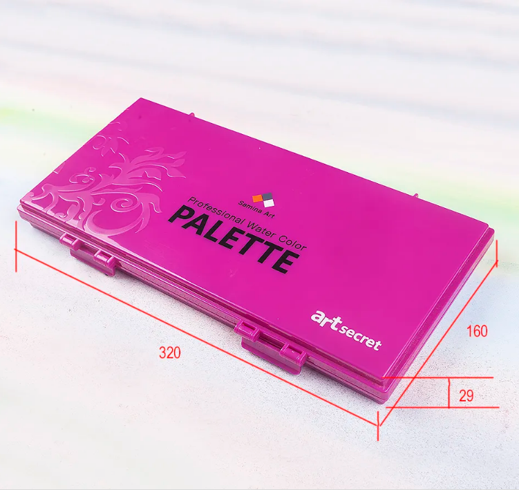
A Watercolor Palette is a tool used by artists to hold and mix Watercolor Paints. It typically consists of a shallow, rectangular or circular plastic or metal tray with individual wells or compartments for holding different colors of paint. The wells are usually arranged in a circular or rectangular pattern, allowing easy access to the paints while painting.

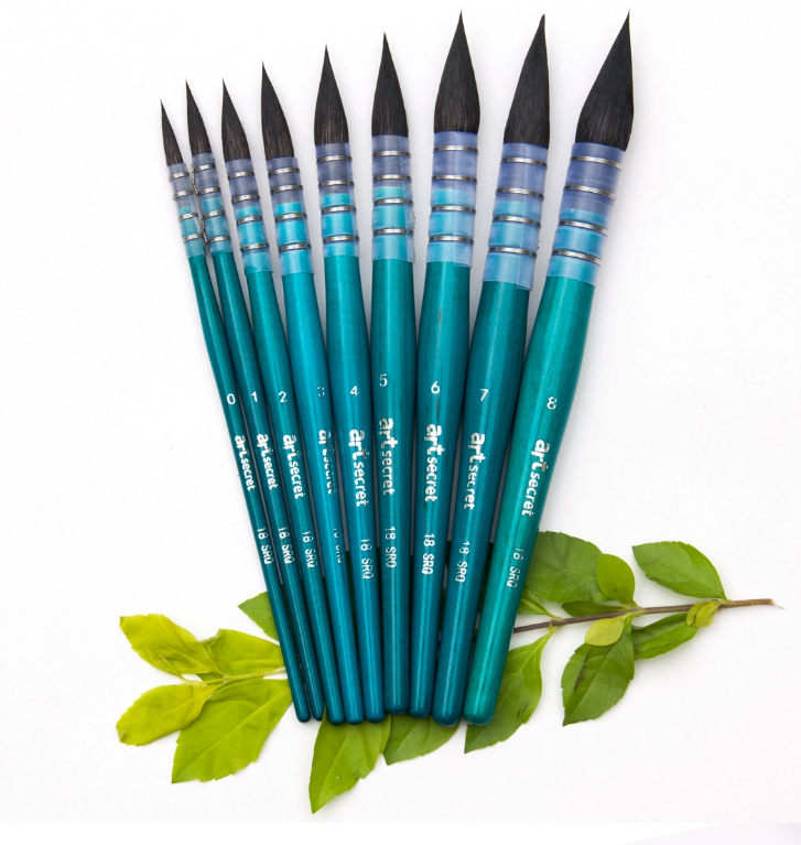
Brush Shapes and Sizes information sharing
As art evolved over time, so did the brushes used by artists. Different brush shapes and sizes emerged, allowing artists to achieve specific textures and effects in their paintings. Brushes sizes are given a number, the smaller the number the smaller the brush. Some of the most common brush shapes include:
Round: Versatile brushes with a pointed tip, suitable for fine lines, details, and washes.
Flat: Brushes with a square end, ideal for covering large areas and creating sharp edges.
Filbert: Brushes with a rounded, oval-shaped tip, perfect for blending and creating soft edges.
Fan: Brushes with a flat, fan-shaped tip, used for blending, smoothing, and creating textured effects.

Watercolor Palette
SAMINA FORAM (SHENZHEN) CO., LIMITED. , https://www.saminabrush.com